SINCE 1971, SOLUTIONS THAT MATTER
As we celebrate this landmark anniversary of our company’s first 50 years in business, we remain aware of the importance of striking a balance between the legacy of the past and a drive towards the future. Certain things remain the same, such as our commitment to sustainability, pioneering spirit, and people-centric approach, while others have changed in response to a constantly shifting world.This is why we made the decision to work on our Visual identity to describe this balancing act between history and innovation, with a reassuring blue and a passionate red.
There are 5 parts to this new and improved identity:
1. a restyled version of the wave design, which is a familiar fixture of the ICA Group logo;
2. a newly-created system of decorative elements based on a reworking of the three letters that make up the word ICA;
3. the use of a color gradient effect shifting between red and blue;
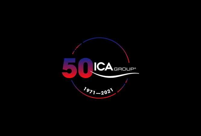
4. a special version of the logo to celebrate our first 50 years;
5. a new concept that encapsulates all the value that we bring to our partners: SOLUTIONS THAT MATTER
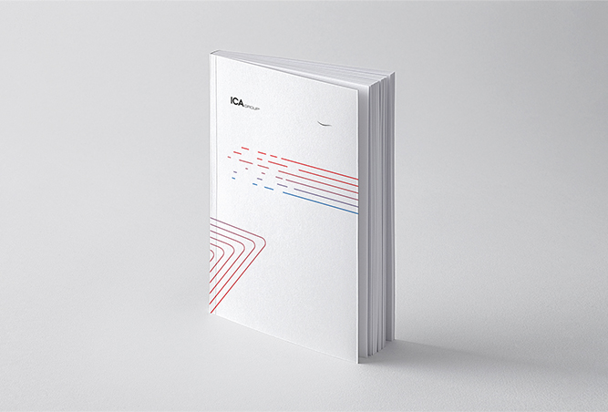
A FAMILIAR LOGO. A NEW WAVE
We know just how important it is to get each detail right. This is why we have reshaped the iconic wave on the ICA Group logo, changing its thickness and traits. The changes we have made will make it more suitable for digital platforms and new communication channels.
SIGNAGE THAT ELEVATES OUR COMMUNICATION
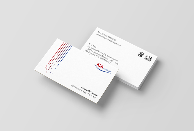
All names are loaded with a potential for expressiveness. With our Visual Identity, we wanted to unleash the expressive force contained in the three letters of our name: the I, the C and the A.
These three letters take on a decorative guise, transitioning from one hue to another in a forward drive into the future.
STILL BLUE AND RED, BUT IN A DYNAMIC FASHION
Our colors continue to be red and blue, which are rendered in a completely new version. The gradient effect allows to convey our dual nature, symbolizing our ability to deliver contemporary, up-to-the-minute and connected responses.
50 YEARS THAT OPEN A CIRCLE
The logo that commemorates 50 years of history is an emphatic statement that 2021 is not the end of a cycle, but rather the start of a new one. We are steering a new course that the entire corporation feels involved in, as we navigate a world of solutions and opportunities.
SOLUTIONS THAT MATTER
As sector pathfinders, we strive tirelessly to innovate products and services, and to deliver the best possible solutions. We want to help our customers both to meet challenges and exploit opportunities to a high level of success. What we do is not limited to a series of products: we propose solutions that yield results, solutions that matter.
WELCOME TO OUR NEW VISUAL IDENTITY
我们不仅了解我们自己的产品并且非常了解我们的客户,知道他们面对的挑战。所以我们提供有效的解决方案帮助他们解决问题。

从产品设计出发到市场投放,我们提供给我们客户最优质的工艺流程。
我们将我们的客户视为合作伙伴,从客户需求出发,提供实质性有效解决方案。

在参与的项目中我们一直使用低碳环保产品减少排放。
要了解最新的ICA集团新闻,请注册新资讯
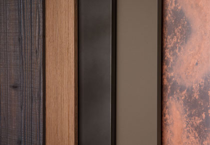
 我们为终端客户提供高品质,创新环保型产品,完美保护木器与玻璃表层。
 ICA 集团在革新创新方面一直处于世界的前沿,尤其是在潮流设计与建筑项目。我们为意大利市场和国际市场提供每年最新的流行颜色和最新效果。
 我们拥有自主知识产权,研发资金,产品环保。这都让我们集团在全世界涂料行业内处于领先地位